Dark Mode Toggle with CSS, HTML, and JavaScript: A Complete Guide
Introduction
Dark mode is no longer just a trend. It is a must-have feature in modern web design. The darker background and lighter other elements in dark mode improve a website's appearance and reduce eye strain, especially in low-light situations.
This guide explains how to create a dark mode toggle on your website using CSS, HTML, and JavaScript. Before you start, you should be familiar with creating a website using HTML and CSS and making it interactive with JavaScript.
Getting started
To begin the process of creating the toggle, complete the following:
- Create a simple index.html website with the following code:
<!DOCTYPE html>
<html lang="en">
<head>
  <title>Dark Mode Project</title>
</head>
<body>
  <nav>
    <div class="links">
      <h2>JSimplified</h2>
    </div>

    <div class="links">
      <a href="/index.html">Dashboard</a>
    </div>
  </nav>

  <div class="container">
    <h1>Subscribe If You Enjoy.</h1>
    <button class='btn btn-outline'>Learn More</button>
  </div>
</body>
</html>
HTML content for index.html
Note: It is in this index.html project that you will add the dark mode toggle. You can use your code if you already have one you want to work with.
Create separate CSS and JavaScript files and link them to the HTML file.
To link the CSS file, add this code in the head section of the HTML code:
<link rel="stylesheet" href="/main.css">To link the JavaScript file, add this code at the lower end of your HTML code:
<script src="theme.js" defer></script>
Note: main.css and theme.js are the names of the CSS and JavaScript files created for this guide. Replace this with the names of your CSS and JS files.
<!DOCTYPE html>
<html lang="en">
<head>
  <link rel="stylesheet" href="/main.css">
  <title>Dark Mode Project</title>
</head>
<body>
  <nav>
    <div class="links">
      <h2>JSimplified</h2>
    </div>
    <div class="links">
      <a href="/index.html">Dashboard</a>
    </div>
  </nav>

  <div class="container">
    <h1>Subscribe If You Enjoy.</h1>
    <button class='btn btn-outline'>Learn More</button>
  </div>
<script src="theme.js" defer></script>
</body>
</html>
If you have everything already in place, proceed to the steps to create the dark mode toggle.
Steps to create a dark mode toggle
This section explains the actions you will complete to implement dark mode on your website.
Step 1: Add the dark mode toggle to your HTML project
To achieve this, you will create a dark mode container using the HTML div element:
Create a div in your HTML project.
Inside the div, define the class for the dark mode toggle. For example
<div class="wrapper-color-switch">Convert the dark mode toggle into a switch that can be turned on and off.
- To do this, create the input type and ID of the toggle. For example
<input type="checkbox" id="input-color-switch">
- To do this, create the input type and ID of the toggle. For example
Create a label for the input. For example
<label for="input-color-switch" class="color-switch">
Note: <label> is linked to the checkbox input via for="input-color-switch." The class="color-switch" allows it to be styled with CSS to look like a toggle switch instead of a regular checkbox.
- Create a div class for the toggle inside the label. For example
<div class="color-switch-toggle"></div>
Note: This additional <div> is a visual element inside the label you created. It represents the moving part of the dark mode toggle that changes position when it is switched. Separating this is necessary for easy styling in CSS.
<!--dark mode container-->
<div class = "wrapper-color-switch">
  <input type="checkbox" id="input-color-switch">
  <label for="input-color-switch" class="color-switch">
  <div class="color-switch-toggle"></div>
  </label>
</div>
Step 2: Write the CSS code for the dark mode toggle
Open the CSS file you already linked to your HTML project.
Add some styles to the index.html project to improve its appearance.
* {
  padding: 0;
  margin: 0;
 }

 body {
  font-family: 'Segoe UI', Tahoma, Geneva, Verdana, sans-serif;
 }

 nav {
  background-color: #222;
  color: white;
  width: 100vw;
  display: flex;
  align-items:center;
  justify-content: space-between;
 }

 .links {
  padding: 0px 5vw;
  display: flex;
 }

 .links a {
  color:white;
  padding: 20px;
  text-decoration: none;
  font-size:  1.1em;
  font-weight: 600;
 }

 .container {
  width: 90vw;
  margin: auto;
  display: grid;
 }

 h1 {
  margin-top: 100px;
  font-size: 3em;
  text-align: center;
 }

 .btn {
  font-size: 1.1em;
  cursor: pointer;
  padding: 15px 20px;
  outline: none;
  font-weight: 600;
  text-decoration: none;
  margin: 20px auto;

 }

 .btn:hover {
  background-color: tomato;
  color: white;
  border-color: tomato;
}
- Create a class for the dark mode and style it.
/* dark mode colors class*/

 .dark-mode {
  background-color: black;
  color: white
 }
Note: The default design of a website’s appearance is light mode. The dark mode style creates the option you need to switch from the light mode to the dark mode.
Style the dark mode toggle. To complete this step, you will style the three different classes of the dark mode toggle you created in your HTML project individually.
i. For the position of the toggle, style <
wrapper-color-switch>
.wrapper-color-switch{
  display:flex;
  justify-content:flex-end;
  align-items:center;
  margin-bottom: 1em;
  margin-top: -15em;
}
ii. For the background, style <color-switch>
.color-switch{
 width:4em;
 height:2em;
 border-radius:10em;
 background-color: white;
 border: 2px solid;
 border-color: black;
 position:absolute;
 cursor: pointer;
}
iii. For the moving part of the switch, style <color-switch-toggle>
.color-switch-toggle{
  width: 1.6em;
  height: 1.6em;
  background-color: black;
  position: absolute;
  border-radius: 10em;
  top:0.2em;
  left:0.2em;
  cursor:pointer;
  transition:all 250ms ease-in-out;
}
On your website, here’s how the dark mode toggle switch would look:
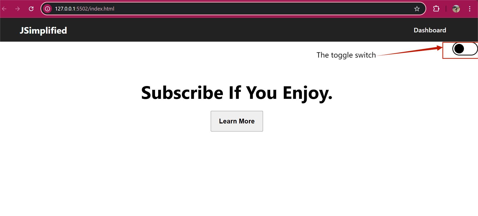
Add some text to the toggle switch to indicate the current mode of the website.
i. To do this, create a class and style appropriately
.color-switch::before{
  content:"Light Mode On";
  position:absolute;
  display:inline-block;
  width:12em;
  left:-8em;
  top:0.4em;
}
Result:
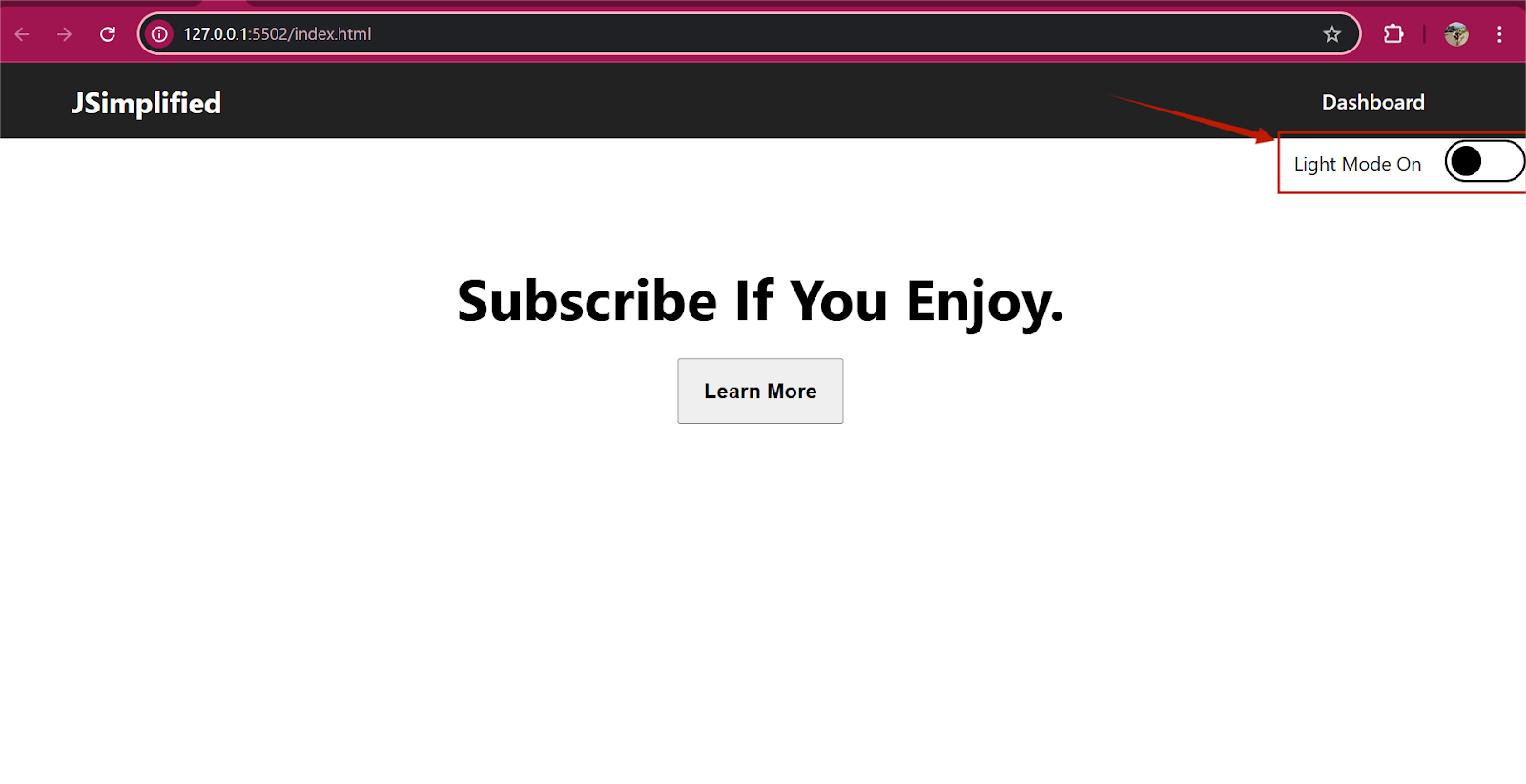
Note: The above code only contains the content for the light mode.
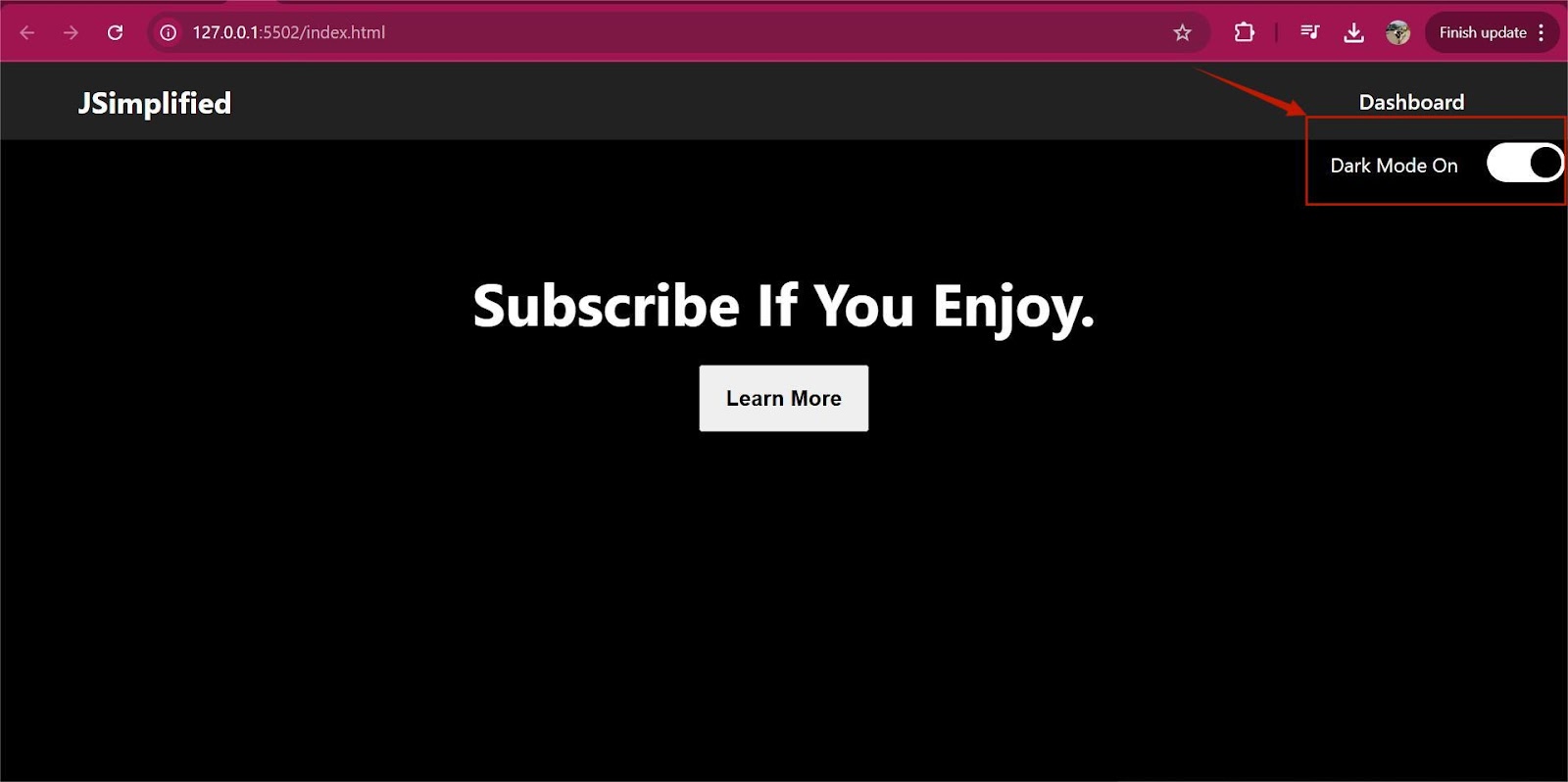
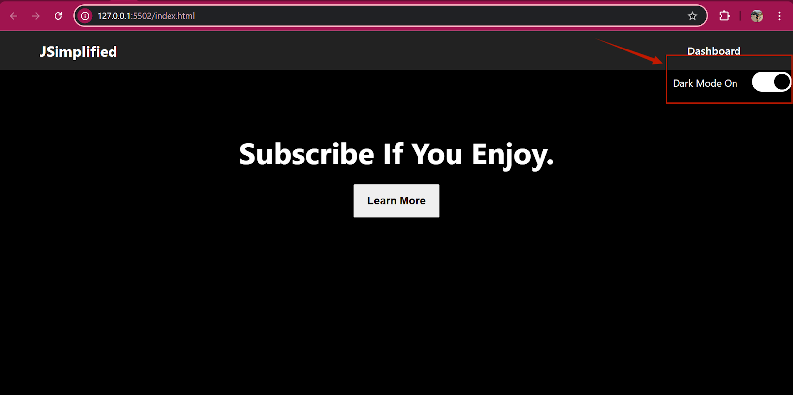
ii. To change the text when the dark mode toggle is turned on, write the code to change the text from Light Mode On to Dark Mode On.
/* this code makes the color switch animate*/
#input-color-switch:checked ~ label .color-switch-toggle{
  transform:translatex(2em);
}

/* this code changes the Light Mode On to Dark Mode On when you click*/
#input-color-switch:checked ~ .color-switch::before{content:"Dark Mode On";
}

#input-color-switch{
  display:none;
}
Result:
Step 3: Add JavaScript code to make the CSS and HTML code interactive
So far, the HTML and CSS code only create the design and text of the dark mode toggle. Nothing happens when you click the toggle. This is because the code is not responsive. To make the code work, you will complete the action with JavaScript. Follow the steps below to do this:
Open your JavaScript file.
Target the class element you created in the HTML code. To do this, add this code
const colorSwitch = document.getElementById('input-color-switch');
Note: This line retrieves the HTML element with the ID input-color-switch and stores it in the variable colorSwitch
Add an event listener
colorSwitch.addEventListener('click', checkMode);Add the CheckMode function.
function checkMode(){
  console.log('checking...');
  if(colorSwitch.checked){
    console.log('dark on');
    darkModeOn();
  } else{
    console.log('dark off');
    darkModeOff();
  }
}
Note: With the EventListener and checkMode function added, when a user clicks the dark mode toggle, the checkMode function will be executed.
3. Write the JavaScript code to turn on and off the dark mode toggle.
function darkModeOn(){
  document.body.classList.add('dark-mode');
}

function darkModeOff(){
  document.body.classList.remove('dark-mode');
}
Note: The JavaScript code listens for clicks and toggles the page between dark and light mode by adding or removing the CSS class <dark-mode> on the <body> element.
Click the link to see the final result
Dark Mode Project - Google Chrome 2025-02-10 15-18-43 - Trim.mp4